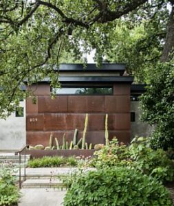
Urban Getaway
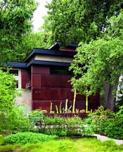
If you didn’t think it was possible to create a peaceful retreat on a pint-sized lot in the heart of a bustling city, then you’ve never been inside the modern, sunlight-filled home tucked beneath the trees in Austin’s historic Bouldin Creek neighborhood.
A collaboration between Jobe Corral Architects, Pilgrim Building Company and Mark Word Design, the home serves as a tranquil escape for a physician couple with equally busy lives and a mutual soft spot for Austin. Rather than building a countryside home where relaxation is inevitable, the couple opted to build an urban sanctuary skirting the vibrant pulse of downtown Austin. It was more than a decade ago when the two stumbled on a less than 800-square-foot, 1930’s wood-clapboard home in the funky south central Austin neighborhood with a deteriorating exterior and interior walls painted with glow-in-the-dark planets and Martians. But the property’s prime location, downtown views and the charming neighboring bungalows, built in the 1920’s and ‘30’s, sealed the deal. Both keen on privacy, the couple bought the recently-renovated house next door when it went up for sale and now use it as a guesthouse for visiting friends.
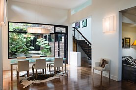
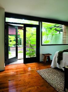
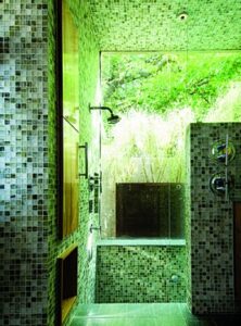
The entire concept of the house was about retreating while in the heart of the city. Camille Jobe, partner at Jobe Corral Architects, worked with the couple to create a tranquil yet modest space that married natural light, big views and open spaces. At the same time, the design sought to foster a sense of privacy for a couple who wanted a place to get away from it all. The c-shaped home cradles an oasis-like courtyard landscaped with leafy plantings and a running water feature that drowns out street noise. Generous windows flanking the courtyard flood interior spaces with natural light, blurring the lines between outside and inside.
Because this project was an urban retreat, the design is inwardly focused, explains Jobe. On the first level, windows aren’t oriented to the street; rather they’re situated as clerestories with wall-to-wall windows peering into the tree canopies and courtyard. The second level windows look out and over the first level to see views of downtown through the trees.
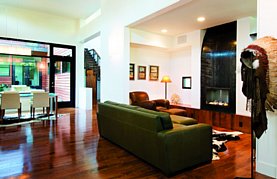
“To sit in the middle of a major urban area and see only trees, garden and sky for your views was the main goal,” says Jobe, adding that every window was strategically placed –– even the small square window next to the fireplace intended for the clients’ dog to be able to monitor the outside action from inside.
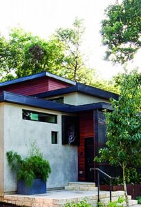
The forms of the house are simple boxes, broken down to allow for light and access.
“We offset the boxes where we wanted windows or doors as if you are slipping the light and the people in and out of the spaces,” explains Jobe. “We also moved the forms around some really beautiful trees on the site and of course removed a big piece in the center to form the courtyard.”
Throughout the process, it was important for the modern home to work well in the context of the smaller craftsman homes that neighbored it.
“We wanted it to be true to its modern nature while feeling like it was part of the Bouldin Creek fabric,” Jobe says.
Although the house is modest in size — restricted by the small 50-foot by 118-foot lot it sits on that was made even narrower by the large trees fringing the property — nothing feels cramped. The home’s raw and simple palette combined with its scale and attention to detail makes it feel intimate and well-crafted.
“We chose quality over quantity here,” says Jobe of the 2,200-square-foot, two-bedroom, two-and-a-half-bathroom home. “The spaces and the form are responsive to the light, trees and grade of the site in a clean, modern way. Quality of materials and manipulation of light allow the textures and details to play the biggest role in how the space feels.”
Giving credit where credit is due, Jobe says the builders are responsible for the meticulous details seen throughout the project while Mark Word Design expertly interpreted the firm’s architectural vision to create a landscape that embraces the structure and its relationship to the site through a rich and textured outdoor scene.
The narrow, sloping lot studded with mature trees created a trifecta of challenges for getting a house built with a driveway and the required parking from the city. Because of the way the trees were located, the only location available for the driveway was up the middle of the site. The out-of-the-box solution was to share the driveway with the neighboring property, reducing impervious coverage over the aquifer and saving green space and trees in an area that values these assets.
As an infill project blocks from downtown, the entire project takes advantage of its position to be kinder to the environment. One of the best ways to address sustainability is to manage the size of a project, says Jobe, adding this one is just big enough to address its needs.
“We used the visual link to outdoor space to make the house feel more spacious,” says Jobe. “Good natural light was essential in every space so the lights stay off until the sun goes down.”
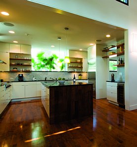
Constructed of SIPS (Structural Insulated Panel System), the home has a tight, well-insulated building envelope. Material selections also lend themselves to sustainability, from the locally sourced mesquite floors which remain durable despite pattering doggie paws to the wood rainscreen crafted from Angelim, a hardwood similar to Ipe but with a more visible fine grain, that serves to pull the exterior cladding off of the insulated wall just enough to allow air to pass between and keep the surface cooler.
One of Jobe’s favorite aspects of the home is the way it maximizes its size by combining and overlapping a lot of the program into one space without feeling that way.
“By subtly shifting the planes of the box, each program area gains its own defined space,” explains Jobe. “The house seems very small from outside, but opens up and unfolds when you enter to reveal its true relationship to the site.”
On the exterior, materials were intended to be beautifully detailed when seen up close but appear subtle from afar. For example, the stucco boasts a smooth troweled finish that strikes a balance between clean-lined and hand-crafted while revealing traces of how it was formed, while the steel panels add texture without being distracting.
“We wanted this house to be strong but soft spoken,” says Jobe. “Some modern houses tend to shout at you. We felt like this one wanted to have a conversation.”
Even a decade later, it’s a space the couple loves to live in — and one that feels brand new each time they walk through the doors.
“To me, it is enchanting,” says one of the homeowners. “You just don’t want to leave. There is so much going on outside in Austin, but when I am here, I don’t want to go out. I want to cook here. I want to stay here.”
- ARCHITECT Jobe Corral Architects 512-499-1591 | jobecorral.com
- BUILDER Pilgrim Building Company 512-707-0760 | www.pilgrimbuilding.com
- LANDSCAPE DESIGN Mark Word Design 512-440-0013 | www.markworddesign.com
Home Design & Decor, “Urban Getaway”, 2017
LINK TO ARTICLE+
